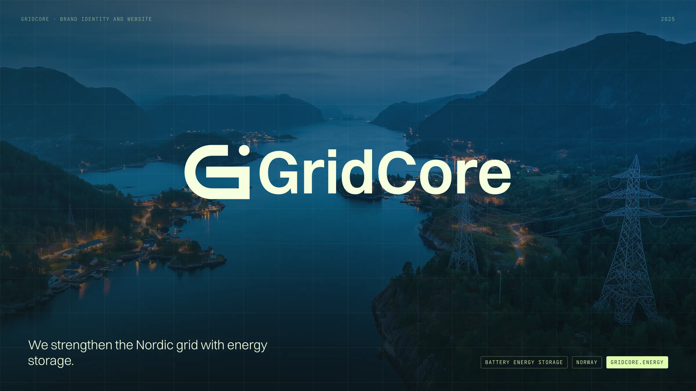
GridCore
A battery storage company for the Nordic grid, given a mark built on the grid itself and a website that explains it plainly.
- Client
- GridCore, battery energy storage, Norway
- Through
- Glitch Studios
- Role
- Brand strategy, identity, guideline and website
- Year
- 2025 to 2026
- Built with
- Figma and Framer
- Live
- gridcore.energy
The mark, moving
The logo builds itself from its own construction: the grid, the arcs, the G, the node, then the name.
The work
GridCore builds and runs battery energy storage across Norway. It has to be trusted by the people who decide where a site can go: landowners, municipalities and grid operators. I made the brand, its guideline and the website through Glitch Studios, on a content structure by Børge Bjelland.
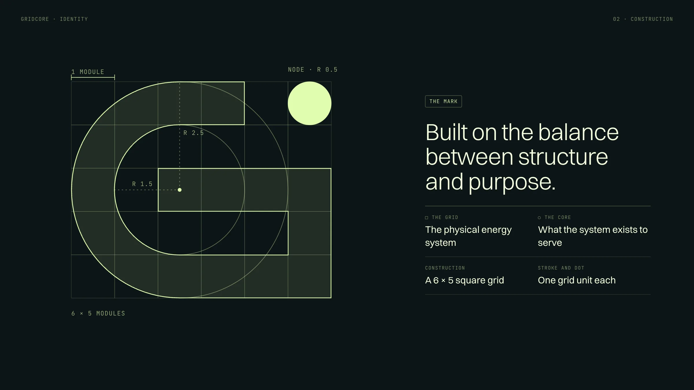
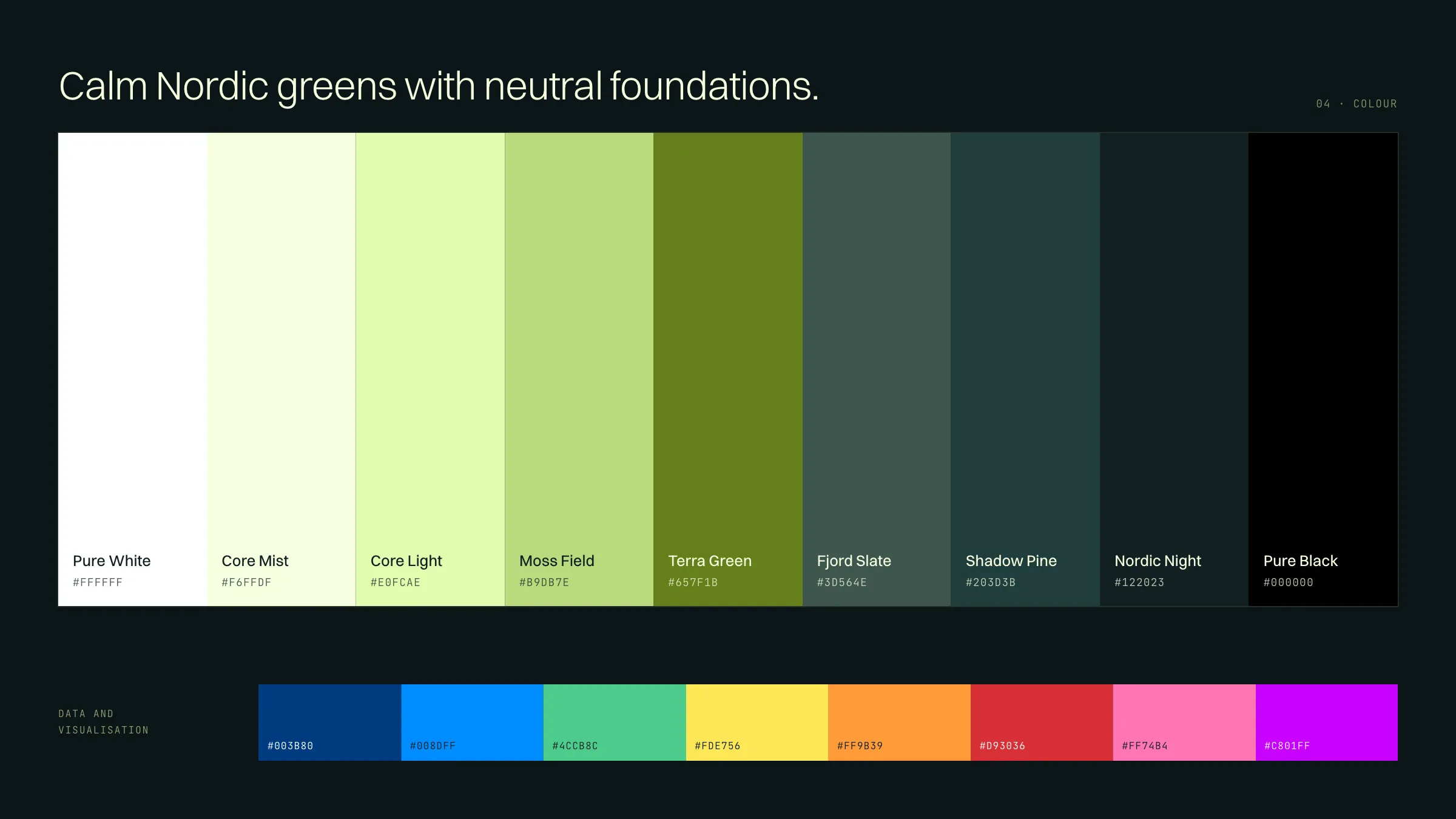
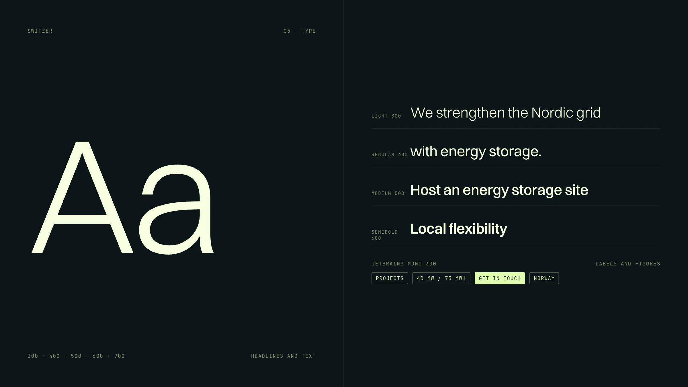
I started with the brand strategy and developed its philosophy: a balance between structure and purpose. The grid is the engineered system, the infrastructure and technology. The core is what that system exists to serve: people, communities and everyday life. The mark is a G drawn on a six by five grid, one unit thick, with fixed radii and a single dot. The colours are calm Nordic greens on neutral foundations, with names like Moss Field, Fjord Slate and Nordic Night. Switzer carries the words and JetBrains Mono carries the figures.
The voice is written down as precisely as the colours: professional, not corporate; technical but human; collaborative and local, each with one sentence to avoid and one to use. The guideline also carries a system prompt that turns a language model into a GridCore editor. It refines text without adding claims, superlatives or em dashes.
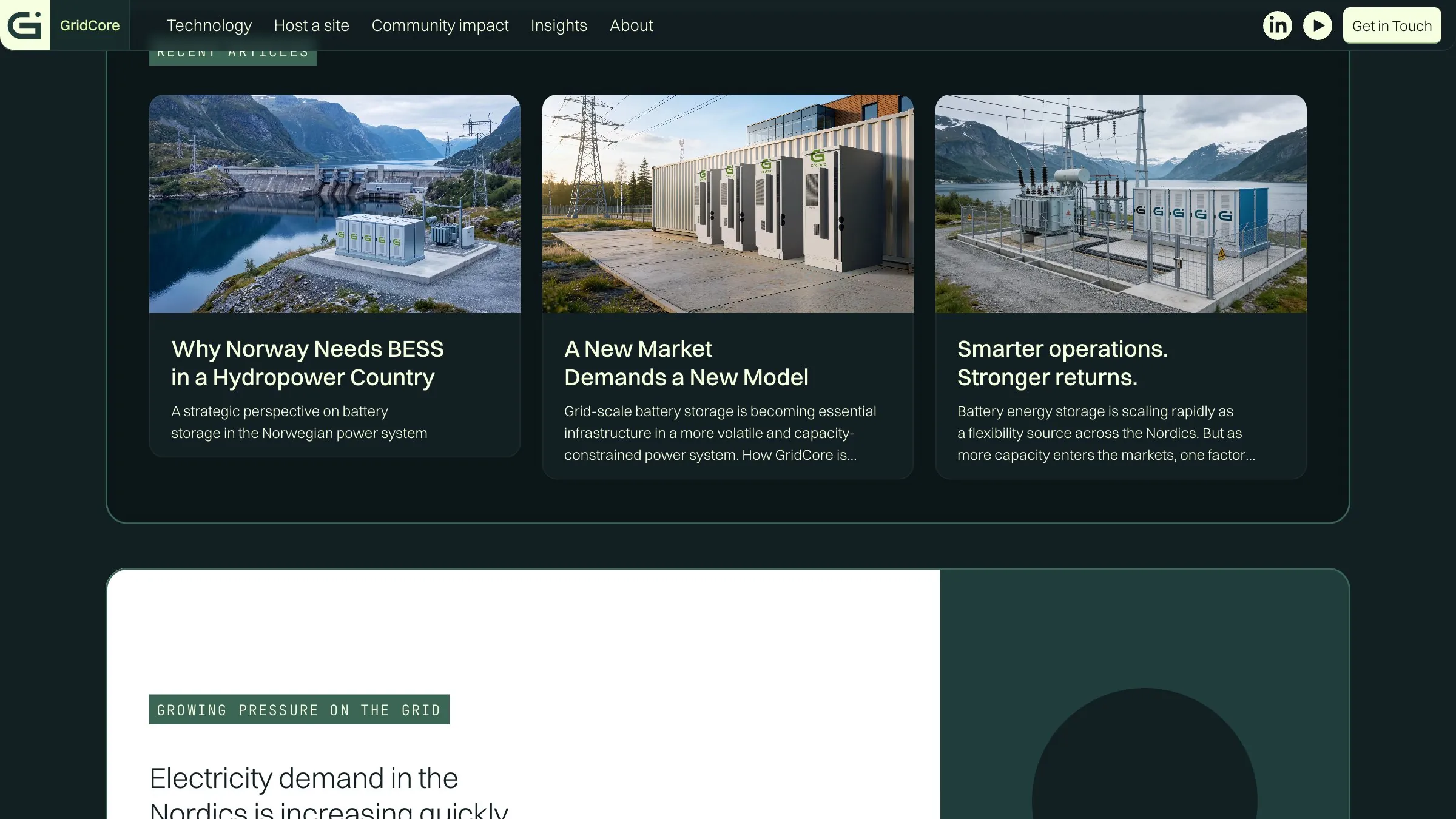
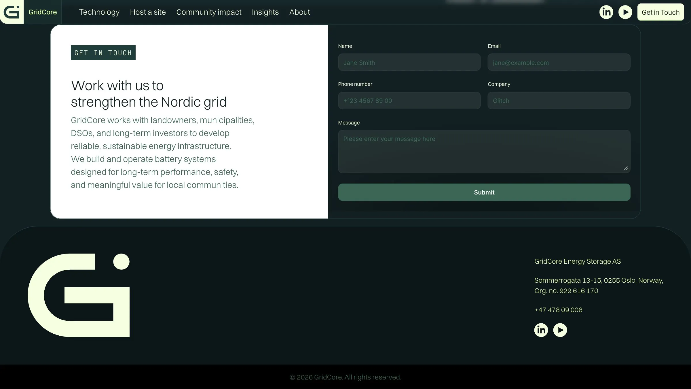
The guideline lives as a website, so the team, its partners and anyone writing for GridCore read the same reference. gridcore.energy is built in Framer on the same system and says in plain words what energy storage does and who it is for.
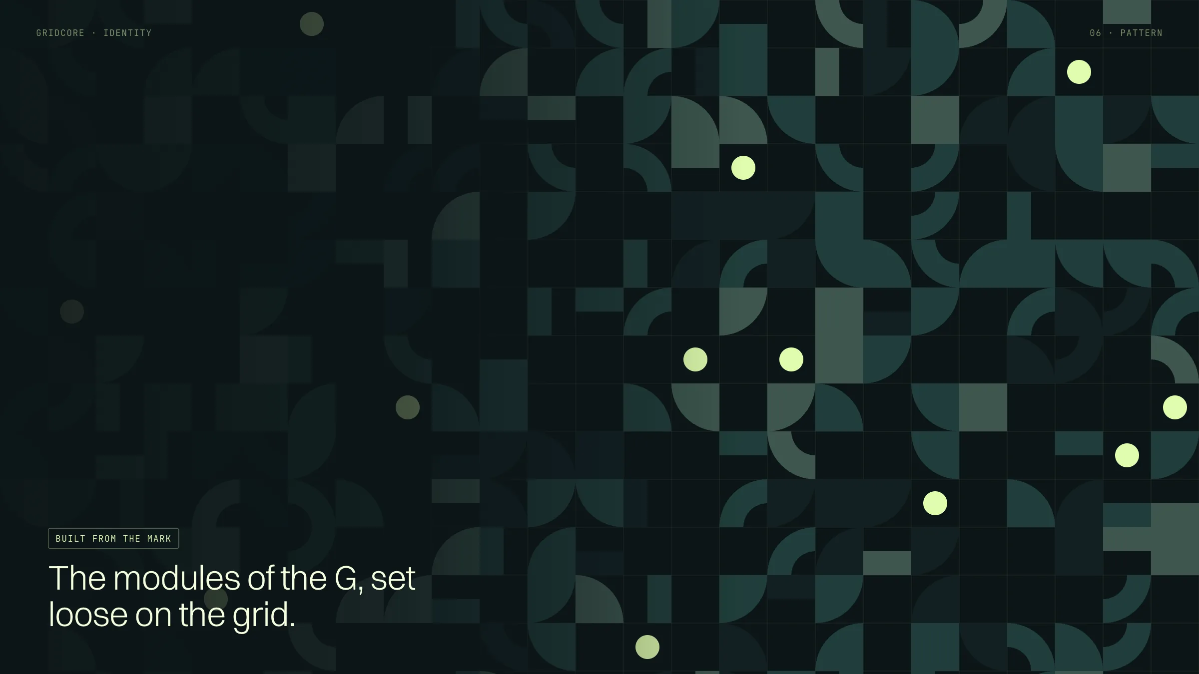
The boards below present that system: the strategy, the mark in motion, colour, type, a pattern made from the mark’s own parts, the article template, and concepts for cabinets, paper, posters and posts.
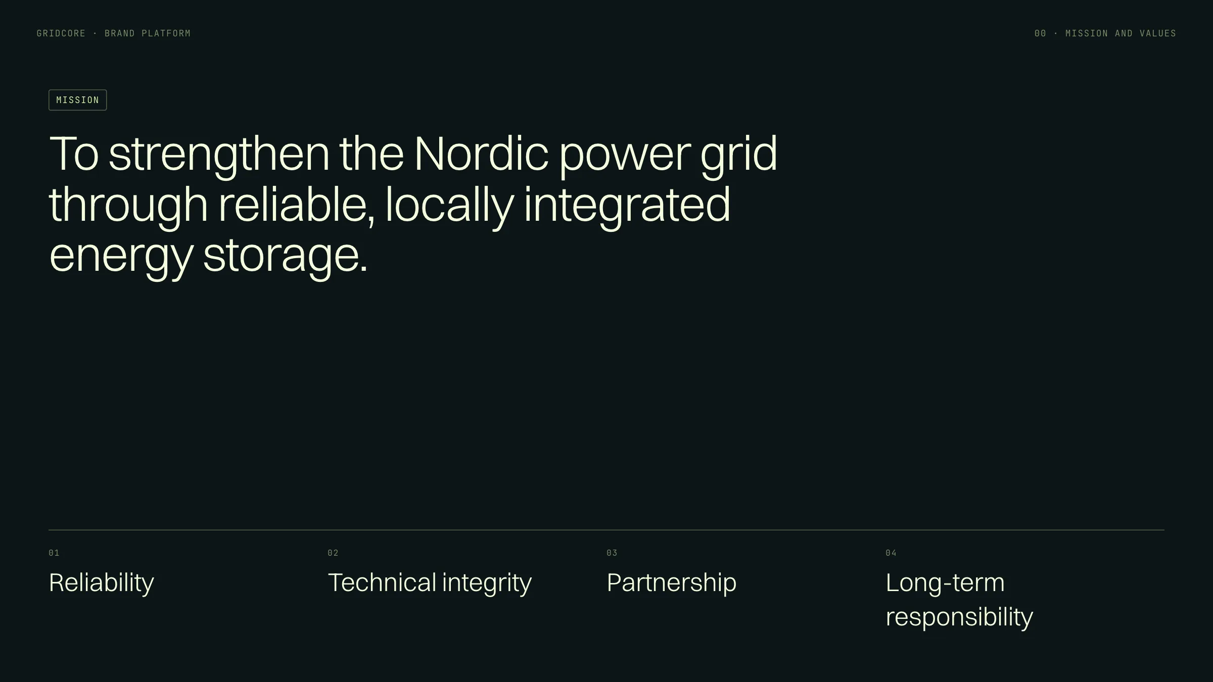
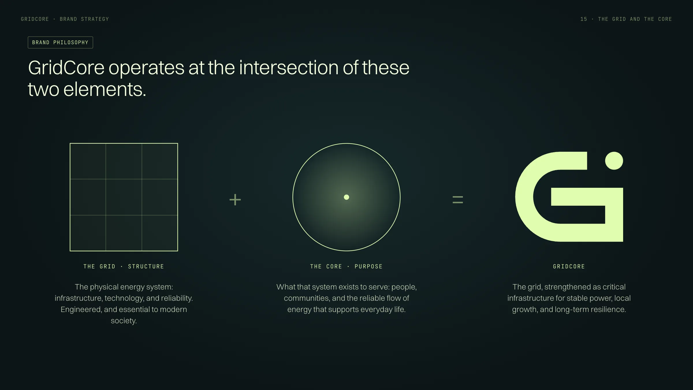
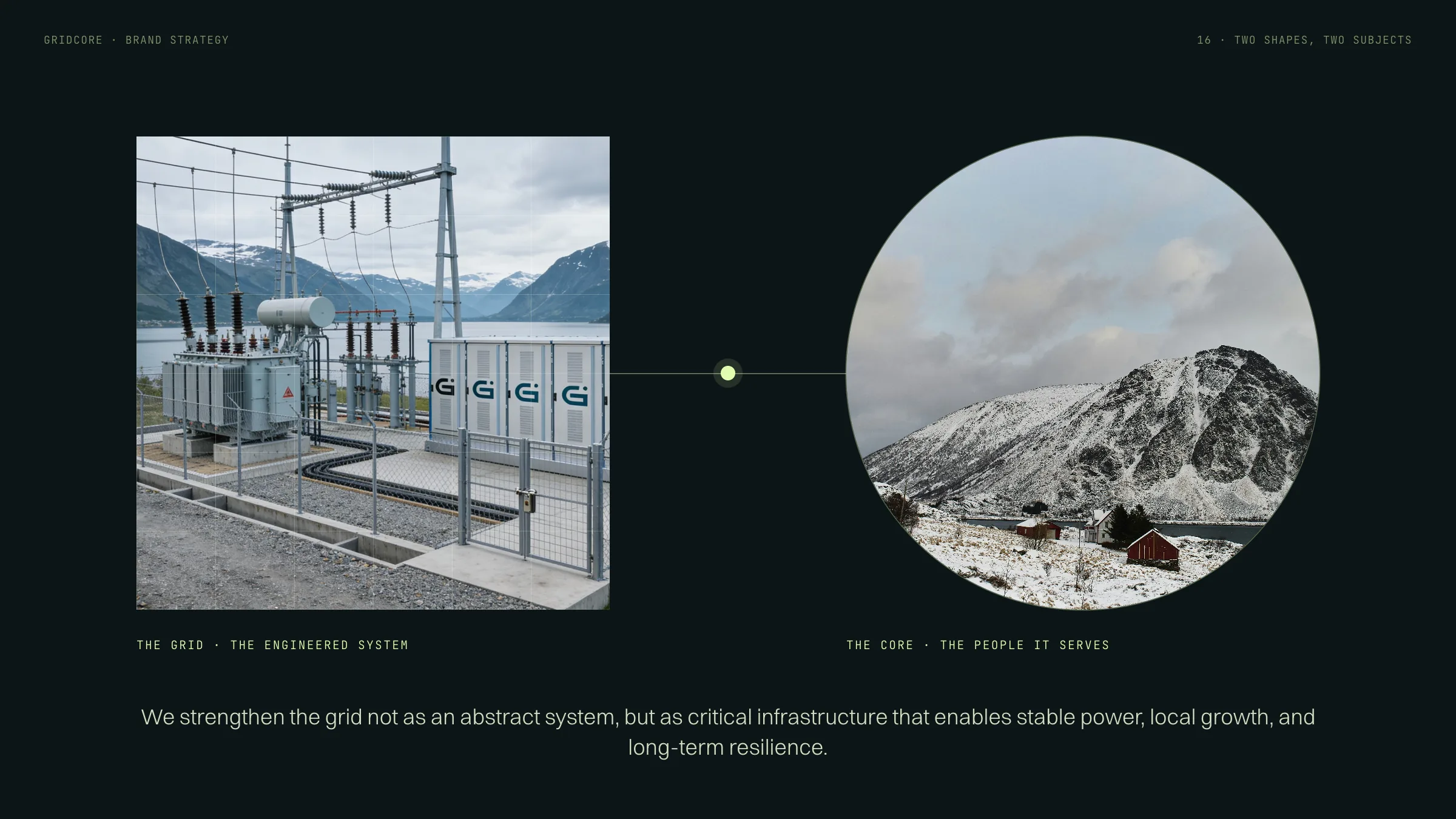
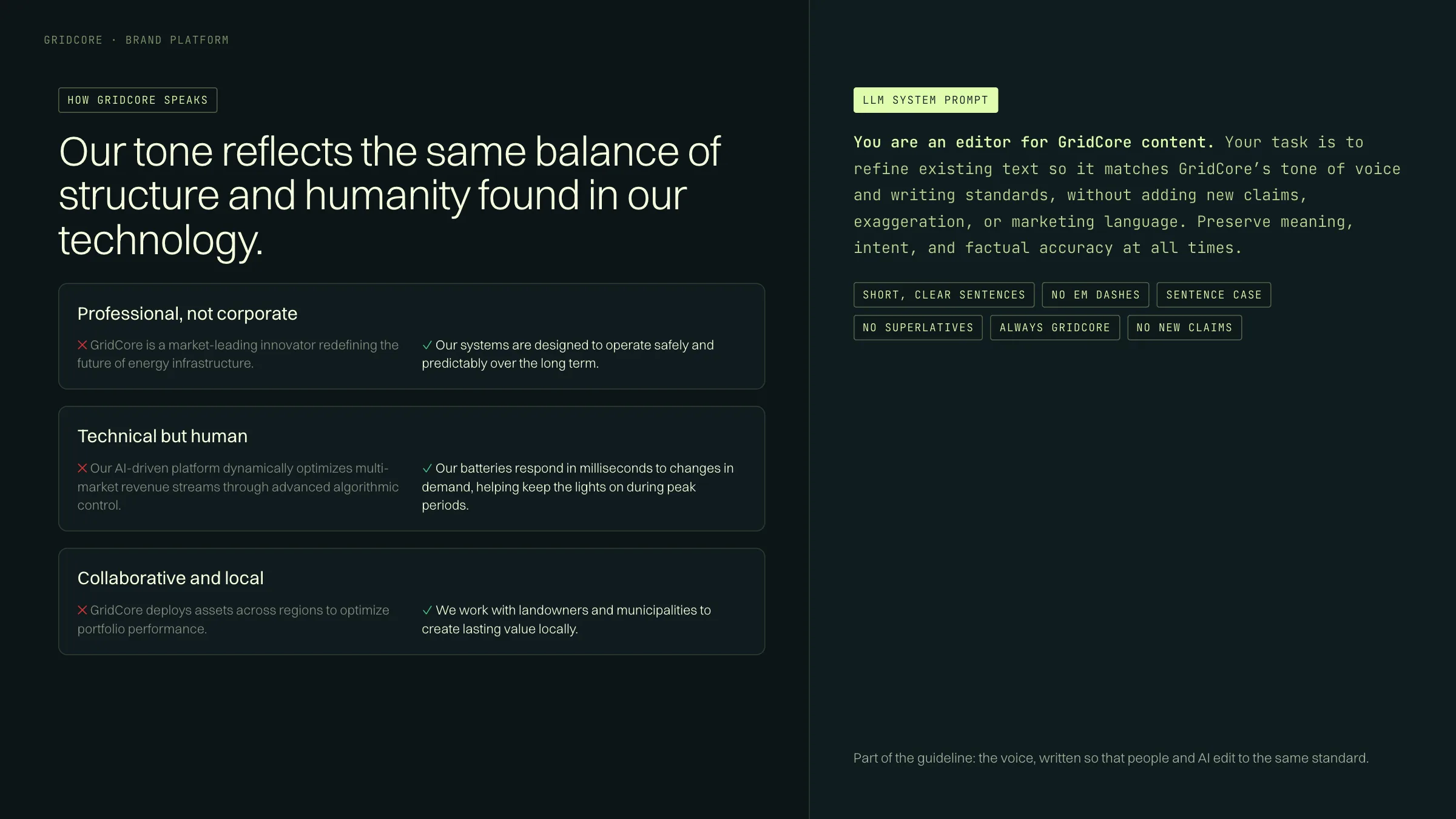
Brand strategy
The platform and the philosophy behind it: the grid, the engineered system, and the core, the people it exists to serve. The voice follows from the same balance.
The grid + the core
The philosophy, moving: the square becomes the mark’s grid, the circle its arc, and the centre of the core becomes the core dot.
The identity
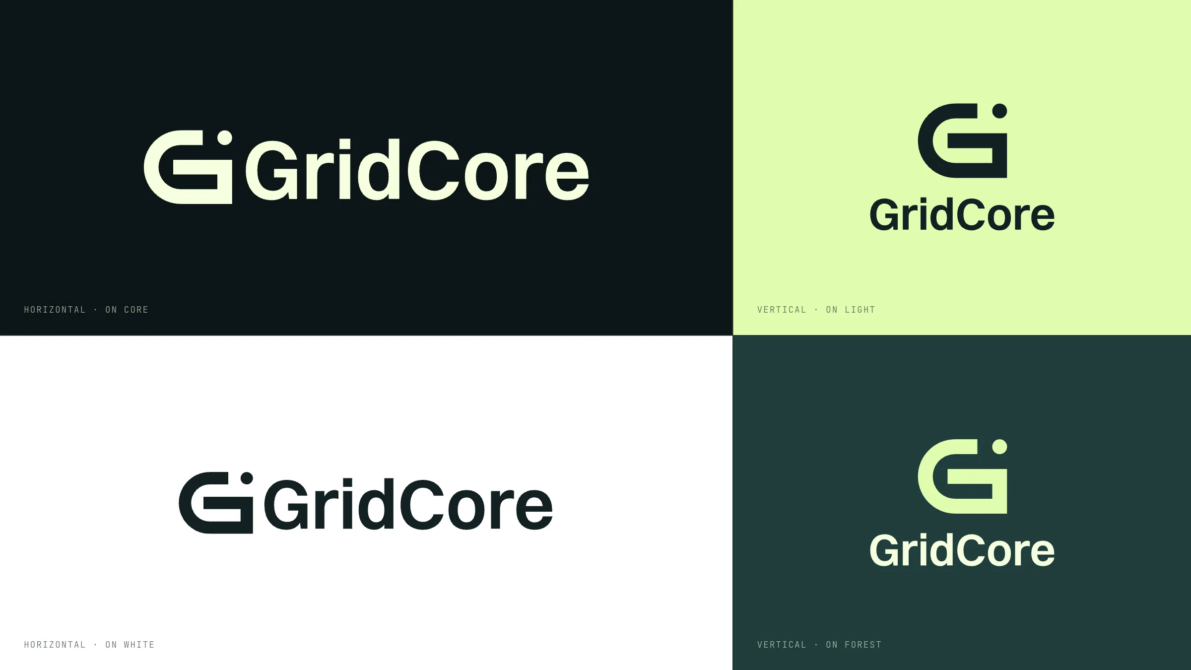
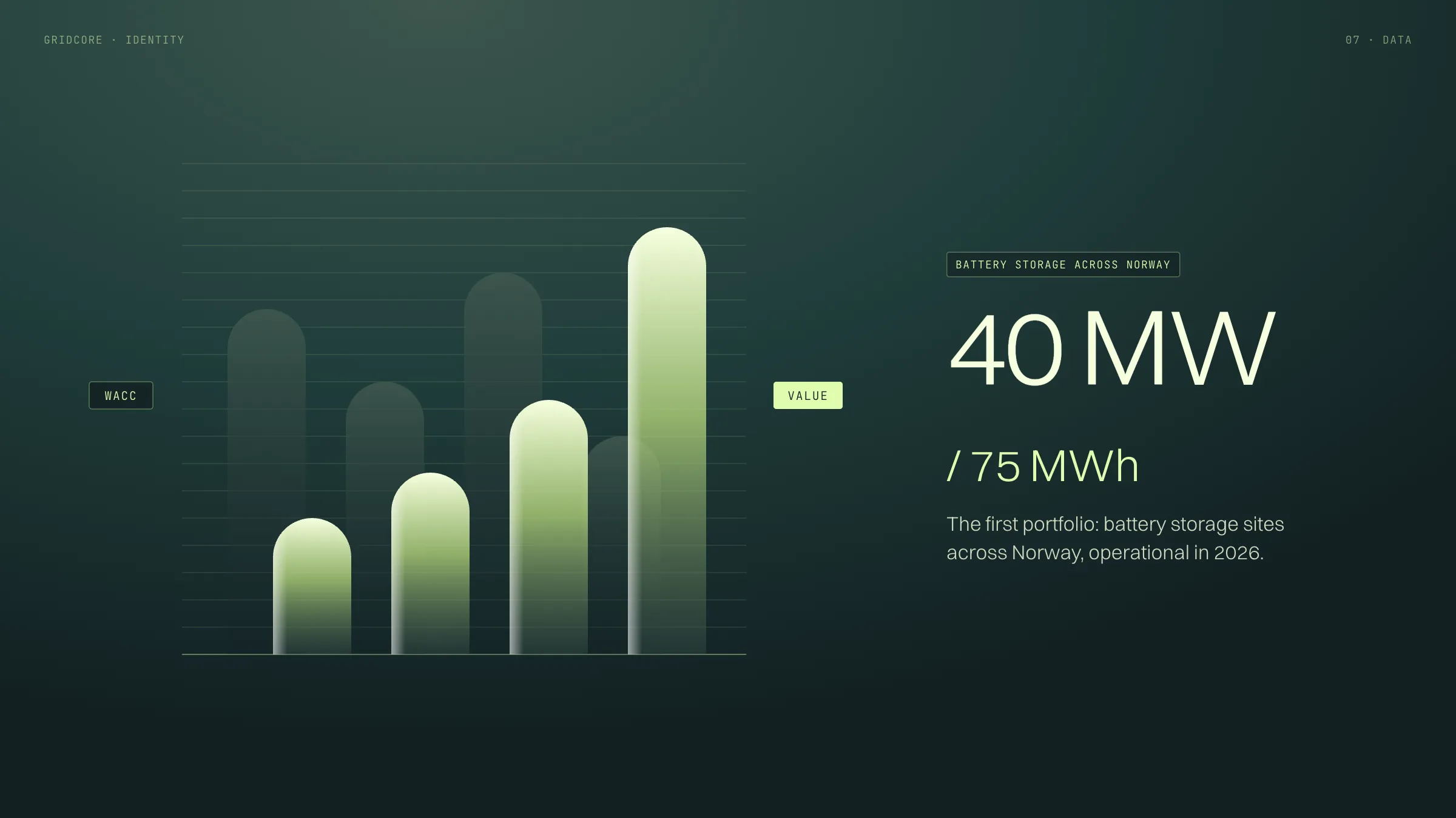
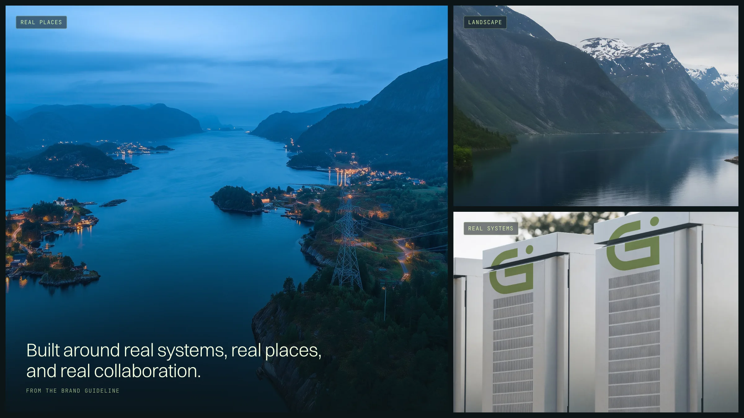
The mark, its construction, lockups, colour, type, pattern, data and photography: one system for everything GridCore makes.
Articles
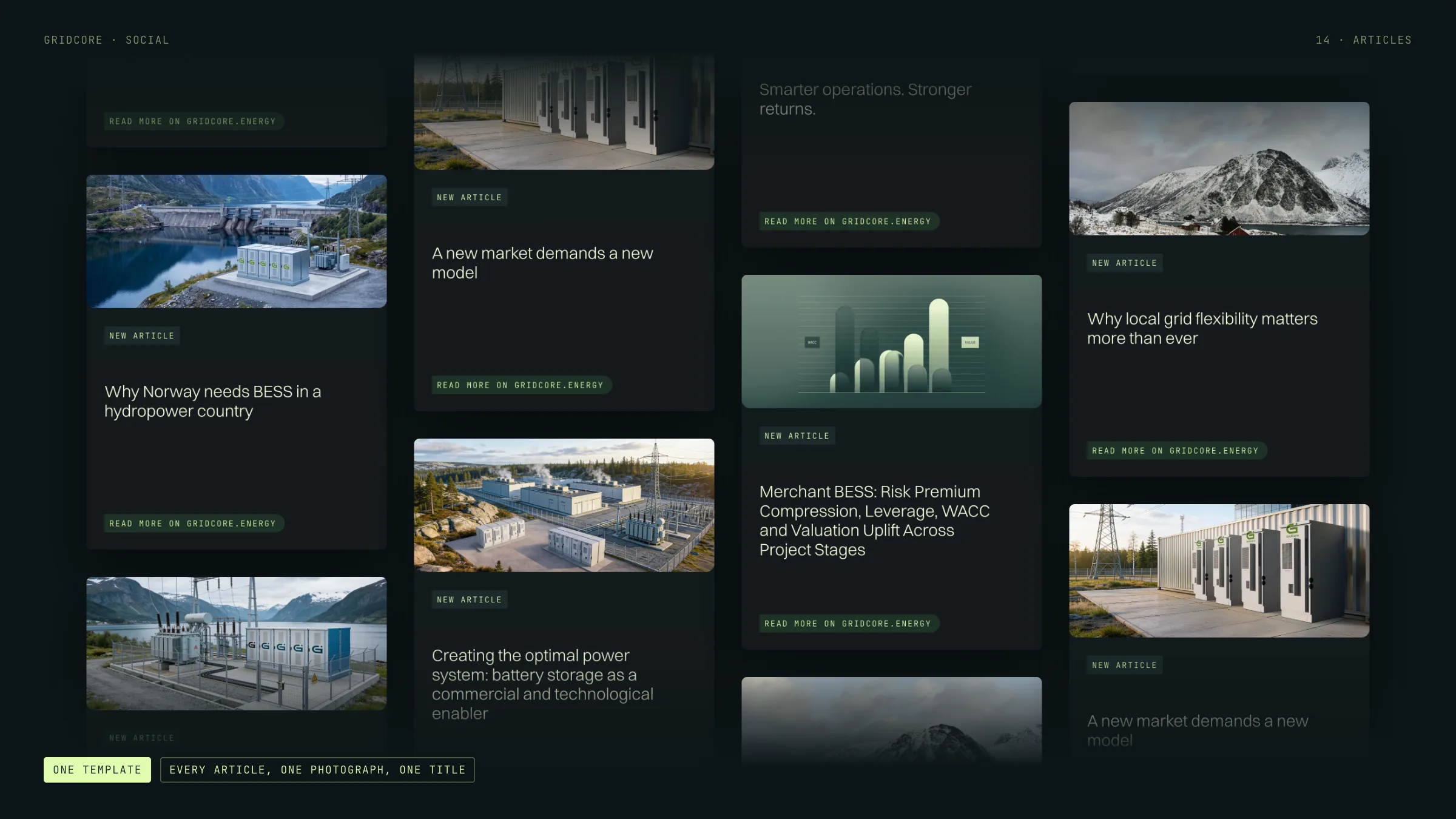
GridCore’s LinkedIn article template, here with photography from the website: one photograph, one title, one link back to gridcore.energy.
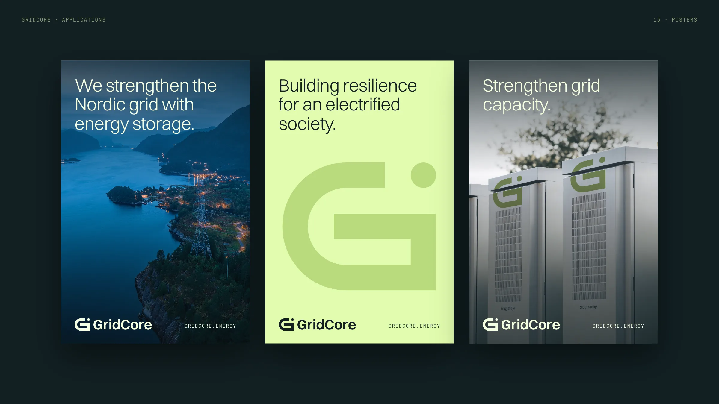
Concepts
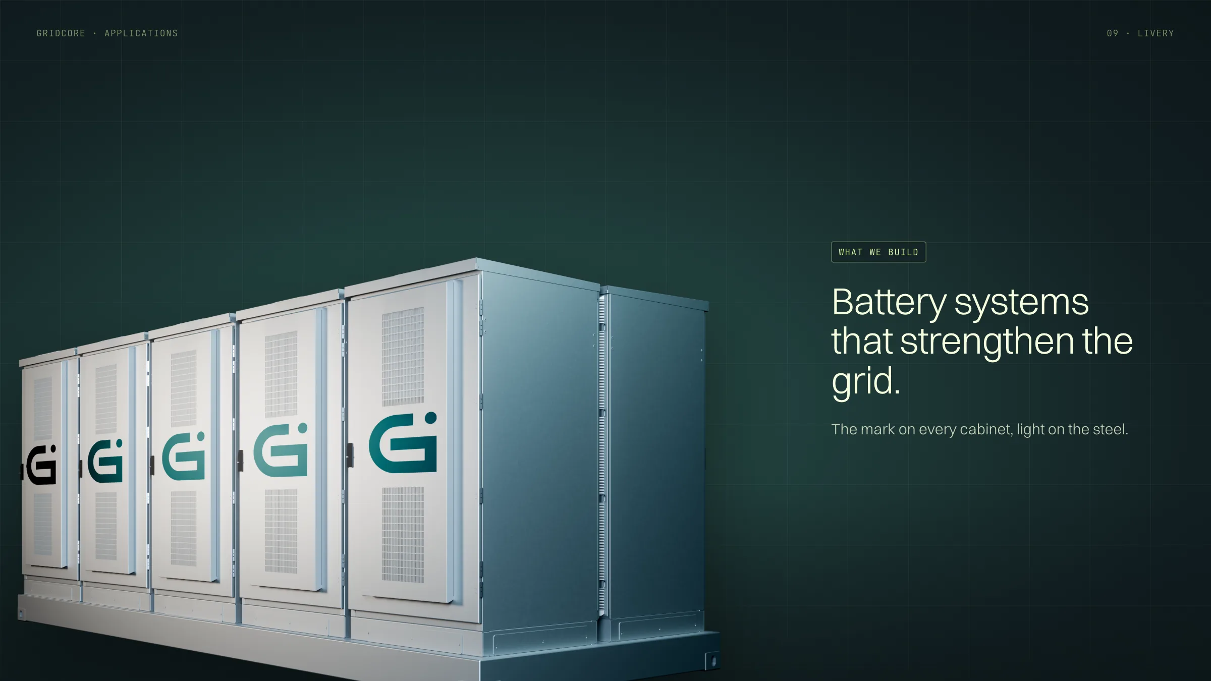
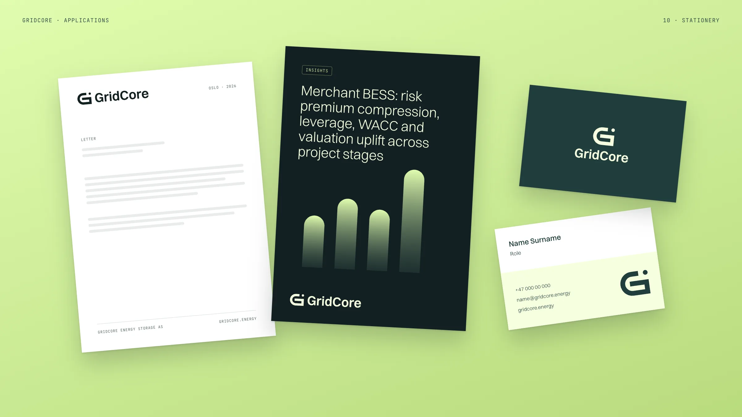
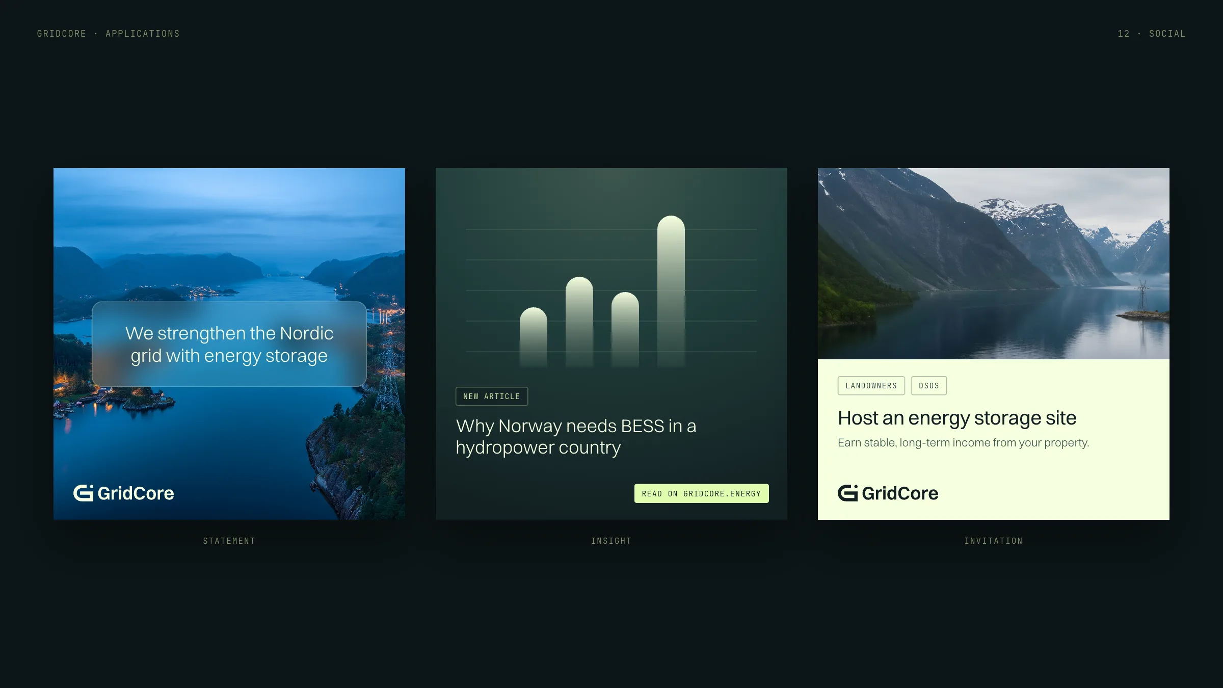
Concepts for the system in use: cabinets, paper, social posts and posters.
The website
gridcore.energy, built in Framer on the same system.
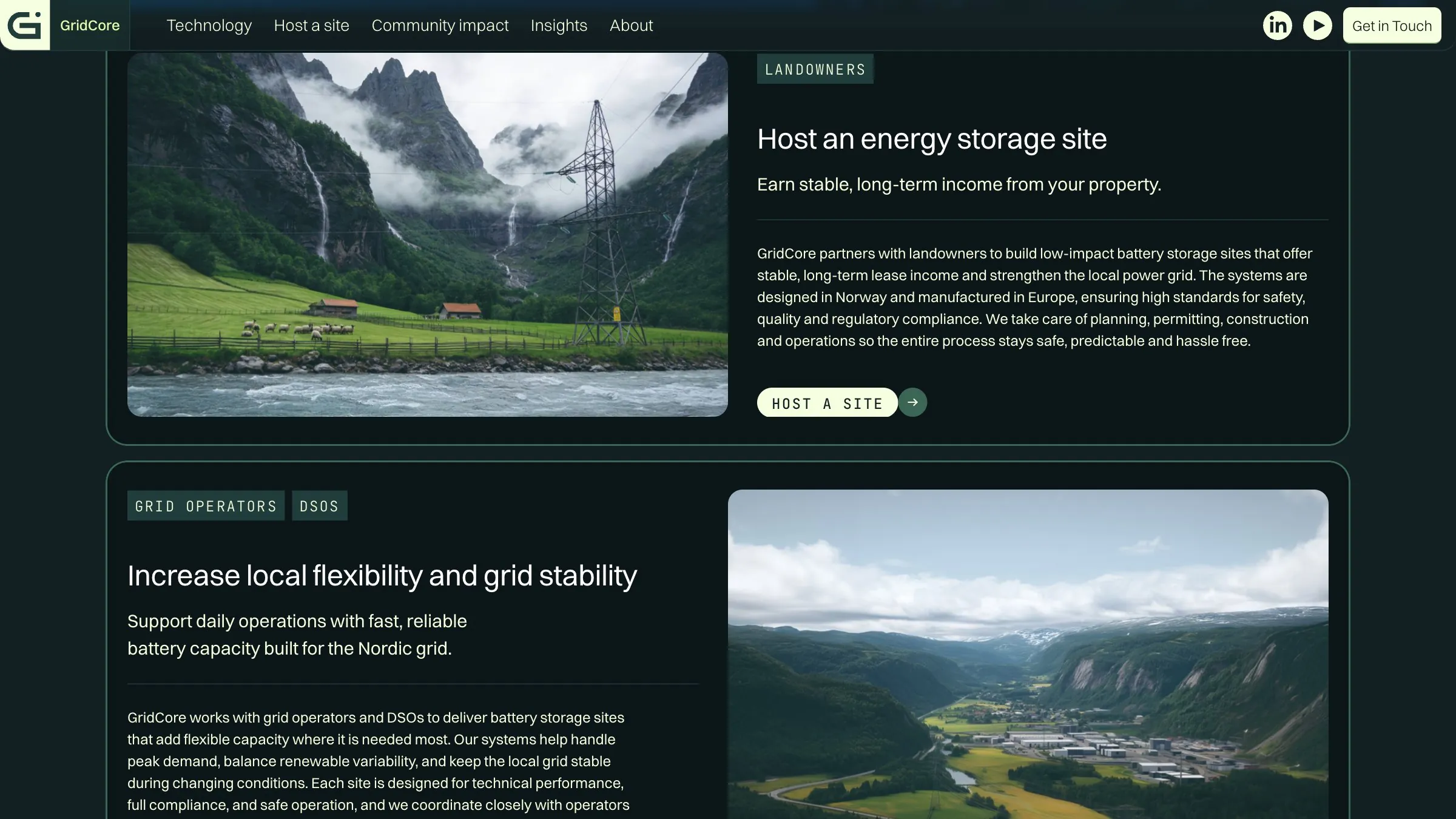
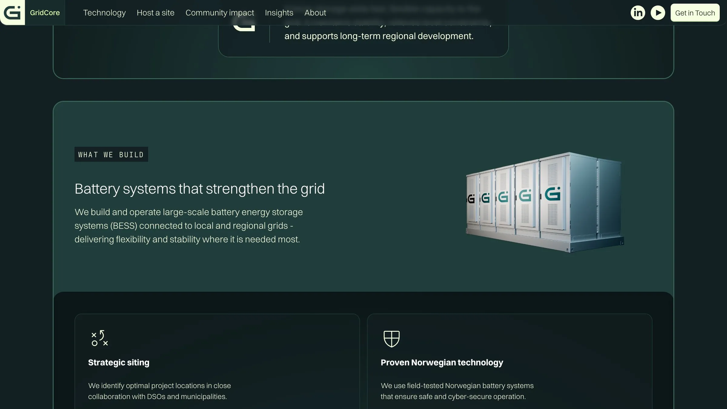
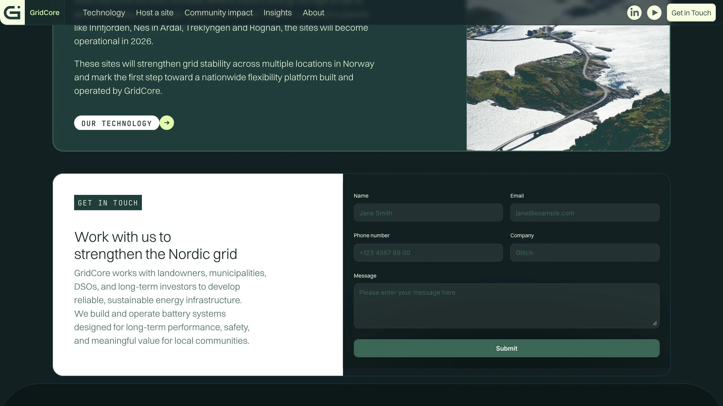
Pages
Pages of gridcore.energy: who it serves, what GridCore builds, the projects, insights and contact.